
What Size Should Your Reception Sign Be? A Guide to Wall Space and Viewing Distance
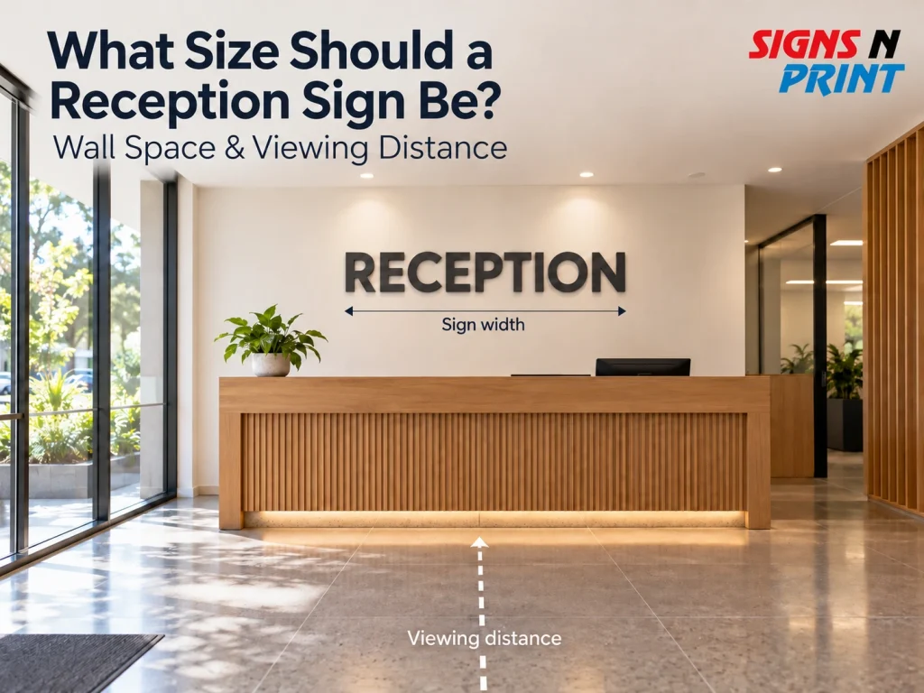
Your reception area creates the first impression of your business, and the right reception sign size can make your brand stand out without overwhelming the space. But how big should an office reception sign actually be? The answer depends on your wall dimensions, logo design, viewing distance and the amount of text you need to display. Whether you have a compact Perth office or a spacious commercial foyer, getting the proportions right matters.
In this guide, we’ll show you how to measure your wall, choose the right letter height and test your reception signage before production.
What Size Should a Reception Sign Be?
There is no universal reception sign size, because the right dimensions depend on the wall, the logo shape, the viewing distance and how much information you want to show. That is why most reception signage is made to suit the space instead of being picked from a fixed list.
A sign with only a logo can stay fairly compact, because people recognise a shape faster than they read words. A sign with a logo and a full business name needs more width, since the words have to stay readable. A long horizontal logo suits a wide wall. A square or stacked logo needs more height and often sits better on a narrower wall.
Wall proportions matter too. A sign that looks perfect in one office can feel tiny in a tall foyer or heavy in a small waiting room. Same logo, different room, different answer.
How Do You Measure a Wall for Reception Signage?
To measure a wall for reception signage, record the total width and height, then work out the usable area after you remove doors, furniture, screens, switches and other features. You only need a tape measure, your phone and something to write on.
- Measure the total wall width from edge to edge.
- Measure the usable width, leaving out doors, screens, columns and other fixtures.
- Measure the wall height from floor to ceiling, and note the space above the desk.
- Measure the reception desk width and height.
- Note fixed items like power points, light switches, vents and smoke alarms.
- Take one photo standing square to the wall, so the lines stay level.
- Stand where visitors first see the wall and measure the distance to it.
Write each number next to your photo. This is the simplest way to work out what size a sign should be for a wall, and it gives you a clear brief for your reception wall sign size.
How Does Sign Viewing Distance Affect Reception Sign Size?
The farther visitors are from a reception sign, the more letter height and visual clarity matter. Most reception areas have three viewing points. The entrance is where people first spot the sign. The reception desk is where they stand and talk to staff. The waiting area is where they sit and often look at the wall for a while.
Check the furthest spot where someone would reasonably look at the sign. The closest spot is rarely the hardest one to design for.
It also helps to separate recognising from reading. A bold logo can be recognised from across the room, but a business name, tagline or web address has to be read. Small secondary text is usually the first thing to fail. Sign letter height and viewing distance always work as a pair, and the next section gives you some real numbers to test with.
What Reception Sign Letter Height Should You Use?
Reception sign letter height should go up as viewing distance goes up, although the exact height also depends on the typeface, contrast and wording. The Town of Port Hedland’s draft wayfinding signage style guide lists the heights below under a heading that refers to Australian Standard AS 1428.2:
Viewing distance | Reference letter height |
2m | 6mm |
4m | 12mm |
6m | 20mm |
8m | 25mm |
12m | 40mm |
15m | 50mm |
These figures are a reference for text legibility on wayfinding signs. They are not a formula for the size of your reception sign, because a logo mixes letters, symbols and shapes. Other guides give slightly different numbers, so use the table only to check your smallest wording, such as a tagline or department name.
A few other things change the result:
- Typeface: simple, open letters read better than thin script styles.
- Letter thickness: thin strokes fade from a distance.
- Contrast: dark on light, or light on dark, works better than similar tones.
- Upper and lowercase: capitals suit short words, while mixed case is easier for longer wording.
- Lighting: glare and shadows can hide parts of a letter.
How Big Should an Office Wall Logo Be?
An office wall logo should be big enough to have presence without overwhelming the usable wall or competing with the desk and other features. This is about proportion, not reading distance. Office wall logo size is a judgement call, and no fixed percentage of the wall works for every space.
Start by comparing the logo width with the usable wall width you measured earlier. Then compare the logo height with the gap between the desk and the ceiling. Try a few widths on paper and see which one feels balanced.
Long business names create wide, short shapes, so they can look small even when they are wide. Square logos need more height. Leave clear wall around the logo too. That space is not wasted, because it gives the brand room to stand out.
Look at the desk as well. A logo that stretches far wider than the desk, or sits very close to it, can look off. For style ideas, see these reception signage ideas for modern Australian offices.
How Do You Choose Reception Sign Dimensions for Different Spaces?
Choose reception sign dimensions by matching the sign’s proportions to the wall, the viewing conditions and the amount of information you want to show. The three examples below are illustrative only. They are not standard categories, and the distances are rough, so replace them with your own measurements.
Small reception:
The wall is limited and visitors may be only 2 to 4 metres away. A compact logo with the business name usually works, and fine detail stays readable at that range. This is common in small Perth offices, clinics and shopfront receptions.
Standard office reception:
Picture a moderate wall with a logo, a business name and viewing distances of about 4 to 8 metres. Balance the logo against the desk width and keep the secondary text simple.
Large commercial foyer:
The wall is bigger and visitors may be 10 metres or more away. Larger dimensional lettering is often needed here, and the extra wall can carry more open space around the logo. This suits Perth offices with tall entry walls and open foyers.
To see how different sizes sit on real walls, look through our past signage projects.
How Do You Check Reception Sign Readability Before Production?
You can check reception sign readability by testing the design at your main viewing distances before anything is produced. Print the logo at full size on paper, stick it to the wall with masking tape and walk around the room.
Then run through this checklist:
- View it from the entrance.
- View it from the reception desk.
- View it from the waiting area.
- Read the smallest text.
- Check the contrast against the real wall colour.
- Look for glare and reflections at different times of day.
- Confirm the key wording is still clear from the furthest point.
This step is about testing, not calculating. If something is hard to read on paper, it will be hard to read on the wall.
Are There Standard Sign Sizes in Australia?
Australia has standard sizes for some sign formats and materials, but not for reception wall logos. Standard dimensions for signage mostly apply to products such as panels, paper sizes and display formats, which come in set sizes because they are cut or printed from set sheets.
A reception logo is different because it can be almost any shape. If you see a list of standard sign sizes, use it as a reference for panels and displays, and let your own wall decide the rest.
Get the Right Reception Sign Size for Your Space
Once you have your wall measurements, photos and logo files, you are ready to talk sizes. Signs N Print is based in Osborne Park, Perth, and works with businesses on reception signage.
Send your measurements and photos to our team through the contact page and tell us about your space.
FAQs
Can a reception sign be too large?
Yes. If your paper version touches the ceiling, the desk line or a screen, the sign is likely too big. A sign that crowds the wall makes the room feel smaller, so go one size down and compare.
Do reception signs need council approval in Perth?
An internal reception logo is generally a different planning question from external signage facing a street, but the requirements depend on the sign, the building and the location. Check the City of Perth’s sign permit information or your local council if you are unsure, and ask your building manager about any lease rules.
How high should a reception sign be mounted?
There is no single height that suits every office, and some requirements may apply. Accessibility, safety and building rules can affect placement, especially if the sign includes tactile or Braille details or helps guide people through the space. Clear fonts and strong contrast also help. Keep the sign clear of the desk, screens and shelves, check with your building manager, and use your paper version on the wall to test the height.